
Agile / Scrum projects are all about delivering value fast and hit the market early with your new product. But of course you need a minimal set to have a product. We call this the Minimal Viable Product. The value graph is a useful tool for the Product Owner to aid in making decisions. Often I make such a graph to discuss with the Product Owner when to release or even to stop development. The only thing you need to do for it is to have the Product Owner be serious about his job and keep the business value of each story (but this is a very, very good thing to do anyway).
An example. We plot the sprint numbers (or time, sprints are just timeboxes, right?) on the x-axis and cumulative delivered business value on the y-axis.
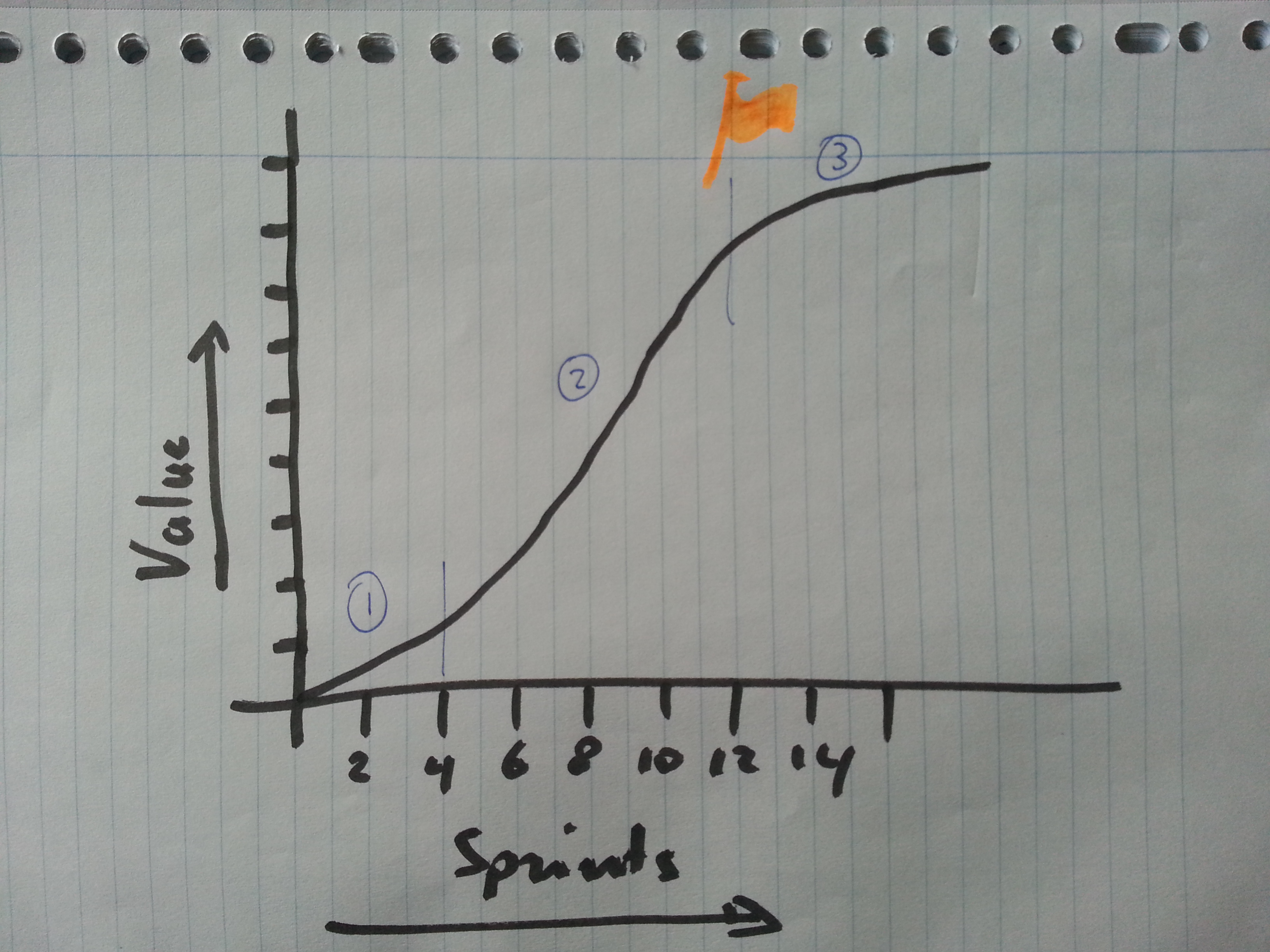
In the graph we see 3 phases: the beginning, the middle part and the end.
Firstly, the project team starts up and overcomes 2 major hurdles: 1) forming of the team and its processes and 2) facing many start-up problems; Usually I start with a ‘walking skeleton’, in a rudimental way connecting systems that we are going to need. This will bring up all those nasty integration errors that you normally have at the end of a project.
Less productivity now, but inevitable for the end result.
The second stage is where the team gets into high productive state. This is what it is all about. Cranking out all those requirements that make the product. We make everybody happy and the product grows like crazy.
But then the third stage sets in, slowly but surely. The value of the delivered software decreases. This is not the team to blame; still we produce as much story points as the previous stage. Rather, all the really useful stuff has been done and now we work on the not-so-important bits. Maybe we’re even creating waste by adding features that will never be used. Time to raise a red flag (mine is orange in the picture 😉 ) and see what’s next. Perhaps it is time to end the work stream, and wait for end-user feedback before proceeding with those low impact requirements.
Hope you can use this in your projects, and you eliminate some waste.